Euro banknotes
The conceptual phase of the creation of the euro banknotes began in February 1996, when the European Monetary
Institute (EMI), the forerunner of the ECB, launched a design competition. A total of
"Ages and styles of Europe" theme
and another of five design series on a "Modern/abstract" theme.
A European market and opinion research organisation was then commissioned to carry out a survey of public
acceptance of the shortlisted designs. Around 2,000 individuals participated throughout Europe. Taking account
of the advice given by the jury and the results of the public consultation, the EMI Council selected, in December
1996, the series submitted by Robert Kalina, a banknote designer at the Oesterreichische Nationalbank. His design
was inspired by the theme "Ages and styles of Europe" and depicted the architectural styles of seven periods in
Europe's cultural history. These styles are shown on the seven euro banknotes:
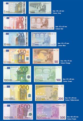
Euro banknote designs
The seven euro banknotes are based on a common design theme – the "Ages and styles of Europe" the notes
(and coins) are legal tender throughout the euro area. On the front of the banknotes, windows and doorways symbolise the
spirit of openness and cooperation in Europe the 12 stars of the European union represent the dynamism and harmony of
contemporary Europe. The back of each banknote features a bridge from one of the seven periods in Europe's architectural
history the bridge is a metaphor for the close cooperation and communication between the people of Europe and between
Europe and the rest of the world. The images are based on the typical architectural style of each period, rather than on
specific structures.
Ages and styles of Europe
- Classical for the €5: it employs vocabulary derived in part from the Greek and Roman architecture of
classical antiquity, enriched by classicizing architectural practice in Europe since the Renaissance.
- Romanesque for the €10: it is the architectural style of Medieval Europe, characterized by semi-circular
arches. The Romanesque style in England is more traditionally referred to as Norman architecture.
- Gothic for the €20: it flourished during the high and late medieval period. Originating in 12th century
France and lasting into the 16th century, Gothic architecture was known during the period as "the French Style"
(Opus Francigenum), with the title Gothic first appearing during the latter part of the Renaissance.
- Renaissance for the €50: it is the architecture of the period between the early 15th and early 17th
centuries in different regions of Europe, demonstrating a conscious revival and development of certain elements
of ancient Greek and Roman thought and material culture. Developed first in Florence, with Filippo Brunelleschi
as one of its innovators, the Renaissance style quickly spread to other Italian cities.
- Baroque and rococo for the €100: Baroque architecture begun in late sixteenth century Italy and was
characterized by new explorations of form, light and shadow and dramatic intensity. Rococo was developed as Baroque
artists gave up their symmetry and became increasingly ornate, florid, and playful.
- Iron and glass architecture for the €200
- Modern 20th century architecture for the €500: modern architecture is a loose
title applied since the late 19th century to buildings in a variety of styles, in which emphasis is placed on
functionalism, rationalism, and current methods of construction. This category often includes Art Deco, Art Moderne,
Bauhaus, Contemporary style, International style, Organic architecture, Streamline Moderne.
Suitable for the blind or visually impaired
The European Blind union was consulted on the design of the banknotes and consequently four features were incorporated
into the banknotes to help the blind and visually impaired to distinguish between them. Each banknote denomination is of
a different size – the higher the denomination, the larger the banknote, it has a dominant colour, with contrasting
colours for "adjacent" banknotes (eg the €10 is red, the €20 is blue), it shows large, bold value numerals, it
features raised print (also called intaglio printing), which makes the ink feel thicker in some parts the €200
and €500 banknotes include additional tactile marks near the edges.